– Alan Stamm, Contributing Writer
Alan Stamm Communications
Makeovers aren’t just for salon clients. Brand logos also benefit from a fresh look to wake up a familiar face and signal other changes.
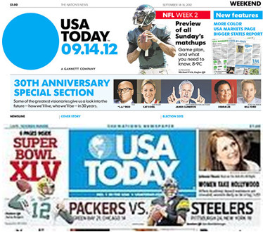
The 30-year-old consumer product shown above splashed a dramatic new style on its face this month.
“The Nation’s Newspaper,” as the Gannett Co. flagship calls itself, replaced its globe in a blue rectangle with a stark blue sphere floating freely alongside the name in a new typeface. Circles in blue and section-specific colors appear elsewhere, overlaid with a news-related graphic or image as part of a sweeping redesign.
“It is simple and straight to the point . . . representing the pulse of the nation,” a company release says of the first new logo since the paper’s birth Sept. 15, 1982.
More than cosmetics are at play, as with any business restyling. “The newly turned 30-year-old is possibly trying to keep up with such new kids on the block as Facebook, Twitter, Huffington Post and The Daily Beast,” former USA Today executive Lauren Ashburn writes at The Daily Beast, a Newsweek-affiliated news site. A current insider, designer Sam Ward, makes a similar point in a staff memo released by the company: “It’s been too long since USA Today has taken a chance.”
A vivid, image-defining logo is particularly important for a product that’s repackaged every weekday.
“In a second or less, you know it’s USA Today,” a former newspaper art director, William Castronuovo of Washington, D.C., says at a journalism blog. “There’s no need for the eyes to look for a staid title or nameplate — see the blue dot, grab and buy. . . . It’s unmistakable and you know in a blink it’s USA Today.”
Reshaping a visual signature is a delicate art, as with any intersection of design, emotion and marketing. Just ask The Gap clothing chain.
The retailer fell on its new face in 2010 with a logo remake that was withdrawn amid customer criticism online and design community ridicule. Its well-known white text on a blue square, had been bumped by black Helvetica text and a small blue square intersecting with the last letter.
“It’s almost as if they’re trying to push aside the brand that people have known for years,” design writer Alissa Walker wrote at Fast Company. The downsized color square, in her eyes, seemed like “an afterthought, a tiny blue symbol up in the corner that’s slowly fading away into irrelevance like a pair of jeans slowly going out of style.”
By contrast, when AT&T in 2005 updated a 21-year-old logo – featuring a blue globe, like USA Today’s old icon – the design was just tweaked by adding transparency, shading and other digital effects. “The new logo is simply a sleeker version of the old one,” notes New York designer Mash Bonigala. “The people behind this redesign opted to use a different shade of blue to produce a more modern personality and change the typography from all caps to lower case.”
Respect for tradition also shows in the globally recognized logos of two teams that are part of SMZ’s client family.
The winged wheel symbolizing Detroit’s hockey franchise dates to 1932, when millionaire James Norris bought the Detroit Falcons, changed the name to Red Wings and adapted the logo of a Montreal club nicknamed the Winged Wheelers.
And the city’s baseball team’s dominate logo has been a Gothic-style “D” since 1904, three years after it became one of the American League’s eight original teams. “There are very few things you can count on today that have not changed. The Old English logo has not,” business professor Michael Bernacchi at the University of Detroit-Mercy told the Free Press last fall. “You instantly, if you know anything about sports, know who it stands for and what it means.”
Whether the product is journalism, jeans or anything else, the logo upholds an old adage: You get only one chance to make a first impression.
What logos do you admire – or wear?
USA Today Unveils Dramatic Redesign on All Platforms
www.usatoday.com/marketing/media_kit/pressroom/2012/releases/091312_USATODAY_UNVEILS_DRAMATIC_REDESIGN_ON_ALL_PLATFORMS.html
USA Today’s Ballsy Move Draws Attention to Newspaper’s Relaunch
www.thedailybeast.com/articles/2012/09/16/usa-today-s-ballsy-move-draws-attention-to-newspaper-s-relaunch.html
CBS Eye, Meet the USA Today Ball
jimromenesko.com/2012/09/20/cbs-eye-meet-the-usa-today-ball/
Gap’s Retro Redesign Incites Flaming Logo Rage
www.fastcodesign.com/1662446/gaps-retro-redesign-incites-flaming-logo-rage
Logo Redesign Need Not Be Radical
http://www.logodesignworks.com/blog/logo-redesign-need-not-be-radical
Tigers’ D logo shows Detroit pride, tells a story over time

